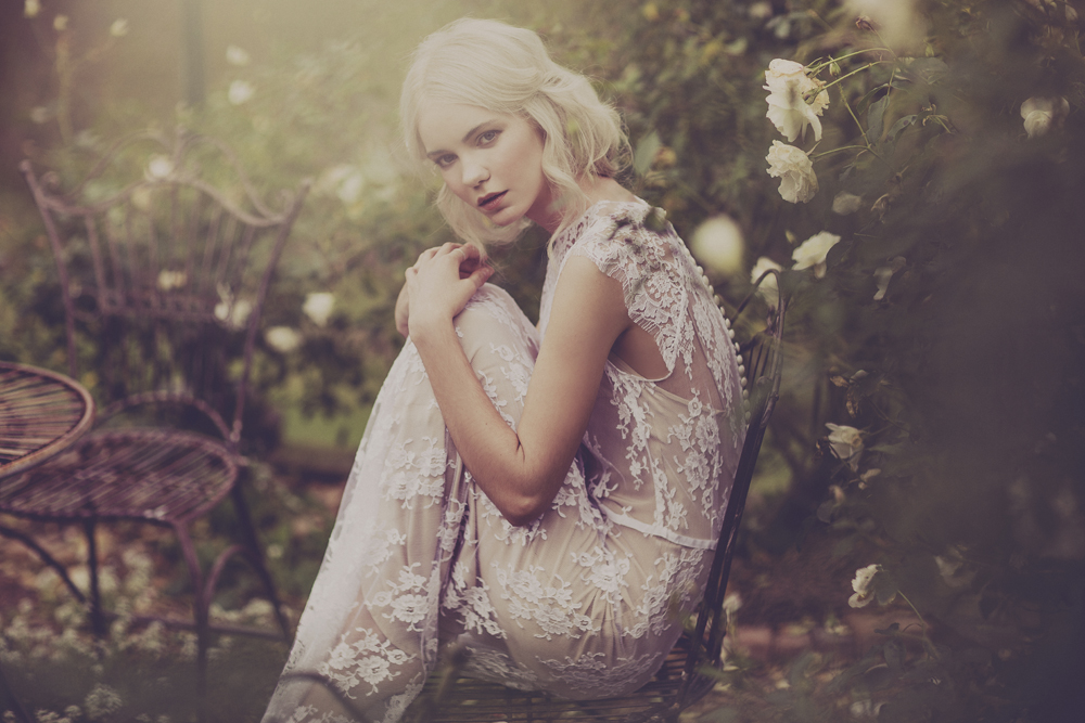
See the rest of the photos on Julia Trotti's blog here.
all these photos have been edited with london for lightroom 4 and overlayed with the softly spoken action in photoshop.

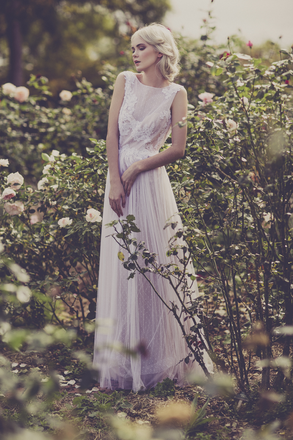
See the rest of the photos on Julia Trotti's blog here.
all these photos have been edited with london for lightroom 4 and overlayed with the softly spoken action in photoshop.

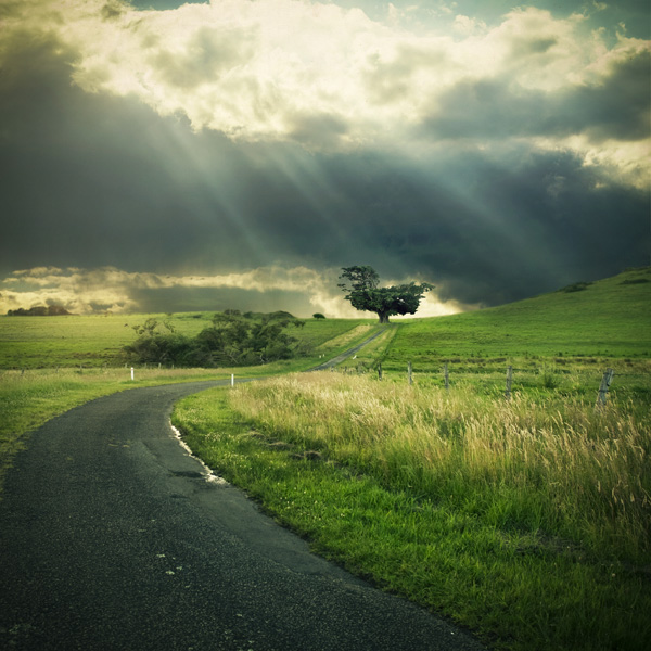
Today I thought I'd create a tutorial showing the process of how I created the image above. The original image I was working with was quite bland, the sky was over exposed and overall just wasn't a very interesting photo. I thought I would create something a little more eye catching from it.
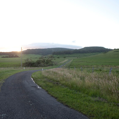
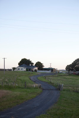
This is the original picture. As you can see the image straight out of the camera is quite bland - the sky is overexposed and nothing catches your eye when you look at it. The first step is to crop the image to a square.
I then create a layer mask and using the brush tool, completely remove the sky and some of the mountains from the original photo. We are left with a blank canvas at the top of the image to work with.

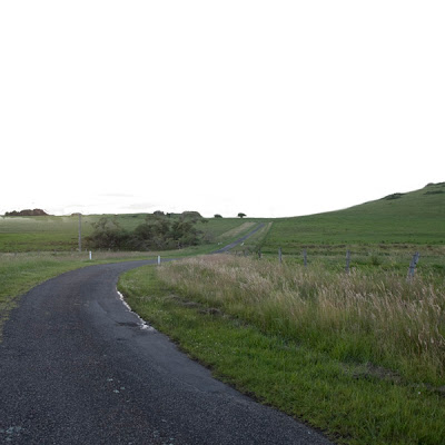
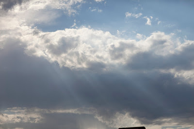
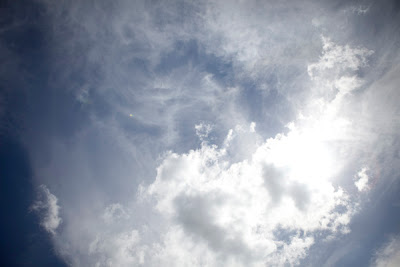
I start by adding a sky image to the white background to start the process of layering to add some depth to the sky. As you can see it looks quite unrealistic when you just add one layer of sky to the background.

I continue adding cloud images, layering them until I am happy with how it looks. With each layer, I add a layer mask and using a large, soft brush, remove sections of the sky until they blend in more naturally with each other. I also use varying layer blending modes and opacities to blend the sky textures further.
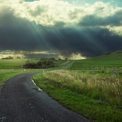
The next step is to colour the image. I start by using some of Digital Film Action's free Photoshop Curves to set the tone for the image. I chose to make it quite dark, contrasty, with lots of greens and blues. Once I'm happy with what it looks like, I create another rgb curve to further tweak the colours to my taste.
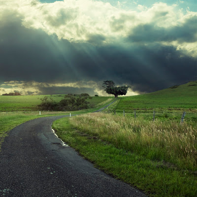
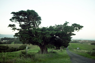
The image still needs a main focus, so I took an image of a tree I had taken on the same day as this landscape image and added it to the end of the road. This gives the image a nice flow, giving your eyes something to fall on when looking at this image. I changed the blending mode of the tree layer to Lighten and used a large, soft brush to remove any excess background from around the tree to help it blend in naturally. I also took a moment to remove the electricity pole that I felt was distracting.
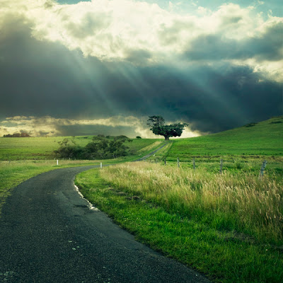
Now that all the elements of the photo are in place, I use a few more rgb curves to alter and tweak the colours and tones of the image until I am happy with what it looks like and we're finished! Below are some of the original images I used to create this final photo.

You may have seen this image floating around in my Flickr gallery, well today I want to show you the steps I went through to create this final image.

This is the original stock image I found on sxc.hu. The moment I saw this photo, I was sparked with inspiration and knew I needed to create something. Sometimes when I creating a photo manipulation, I will have an idea beforehand which means I need to go out and find or create the perfect photographs for my idea. And other times like in this case, I will come across a photo that sparks that idea.

The first step I take is to crop the image to a square. I like the look of the town to the left and the clouds to the right, so in order to not lose them through cropping, I select both sides of the image and transform them. I pull them in closer to the centre of the image so the town and clouds are included. This also gives the hill more a rounder, cartoon like curve which I really love for the feel of this photo.


The next step is to begin the colouring process. At first I use Digital Film Action's free Photoshop Curves to give me a base of what I want the colours this image to look like. I went for a much warmer and vintage feel compared to the original image. Once I am happy with what the overall colours look like, I make a new curves adjustment layer and tweak the colours and tone further.

Last but not least, I add the final touch of the birds flying from one of my own images from my archives. I set the layer blending mode to Lighten, Opacity at 100%. I also apply a layer mask to the birds to remove any birds that aren't sitting right in the image. Once I am happy with how it looks, I copy and flip the bird image to make it seem like the birds are flocking from the tree in two groups.

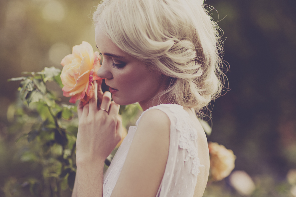
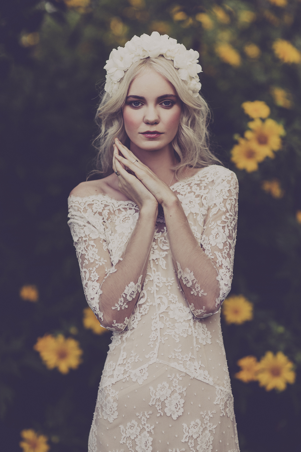
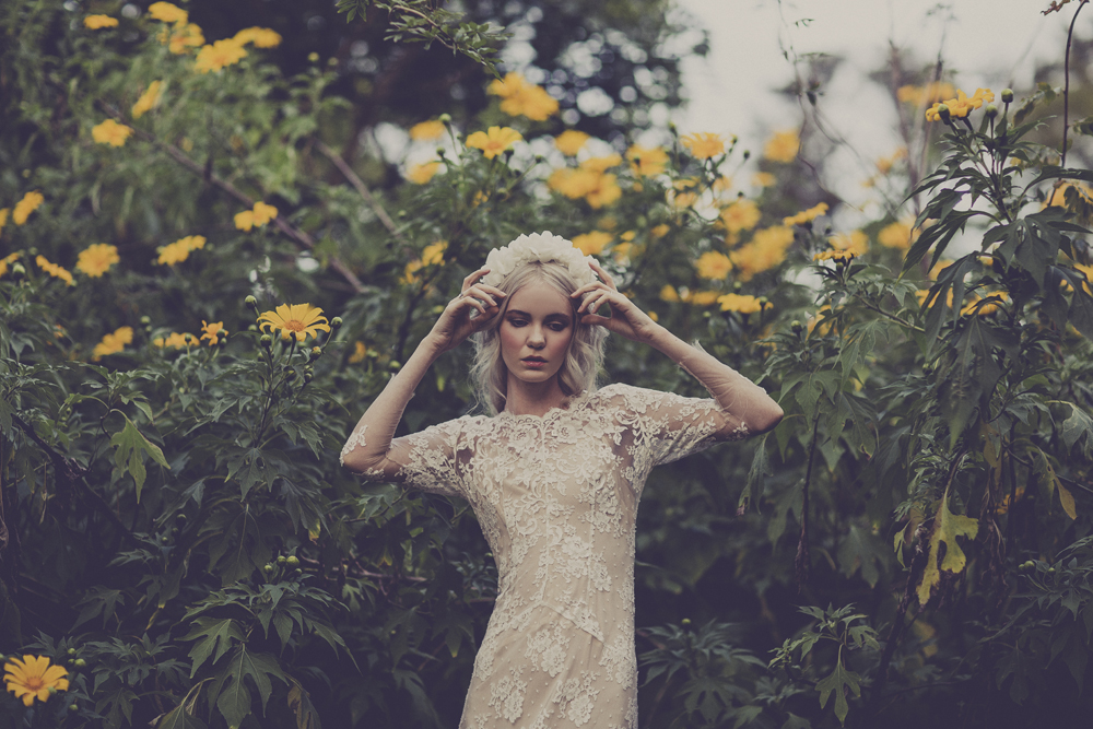
Model: Madeline
We were shooting photos for the front cover of a novel, so I decided to play around with one of the outtake photos to see what I could create. I experimented in Photoshop layering textures and lights and this is what I came up with.
Below are the steps through my process of creating the final image you see above.

The original photograph was taken in portrait orientation against a white backdrop. I wanted this image to be square, so I extended the crop of the image and begin filling in the rest of the wall using the stamp and clone tool.

Once the background was finished, I edited the colours using my free Photoshop Curves. I tried going for a look that was washed out in the colours, but punchy in the tones. I then layered some long exposure lights photos I had in my stock library, setting the layer blending mode to lighten and the opacity at about 50%. Once I was happy with where the lights were in place, I created another Photoshop Curve adjustment layer to tweak the overall colour and tone in the image. And there we are left with the final photo!
